- Published on
Let's explore Unified Interface for Dynamics 365
- Authors
- Name
- Piyush Paliwal
- @_ppaliwal


So by now you might have already heard or read about the new Unified Interface that Microsoft is working on for its Dynamics 365 or as I like to call it Dynamics CRM platform and it will ship along with the latest version of CRM i.e. 9.0. Microsoft have recently started provisioning preview instances for people to take an early look at all the new features. So lets go ahead and start exploring.
What is this Unified Interface?
One UI suits all form factors. In simple terms, Unified Interface framework provides a uniform experience for all the business applications available for Dynamics 365. The main focus of this new interface is Accessibility. The system needs to adapt and perform to anything that the user throws at it like screen readers, reading plugin, keyboard shortcuts for easy navigation and of course responsive design.
What changed?
Short answer is almost everything (well, not really but very close to it). Here is a small list that will interest you.
- Form layout
- Removal of whitespace (Yayy!)
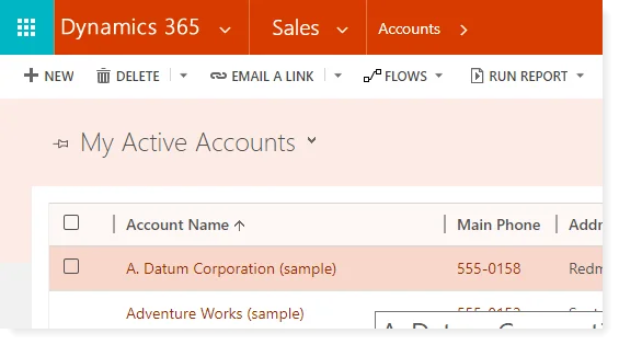
- Sub-grids and Grids in general
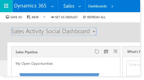
- Dashboards
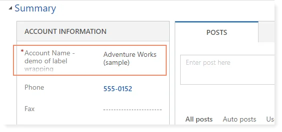
- Long text labels and values are now wrapped (big thank you to Microsoft for finally providing this)
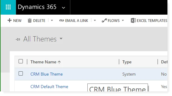
- Addition of new color themes
- Blue Theme
- Default Theme
- Orange Theme
Lets explore each of them one by one.
Form layout changes
Field labels and values are now the wrapped

Removal of white space, section headings and merging of header and body sections

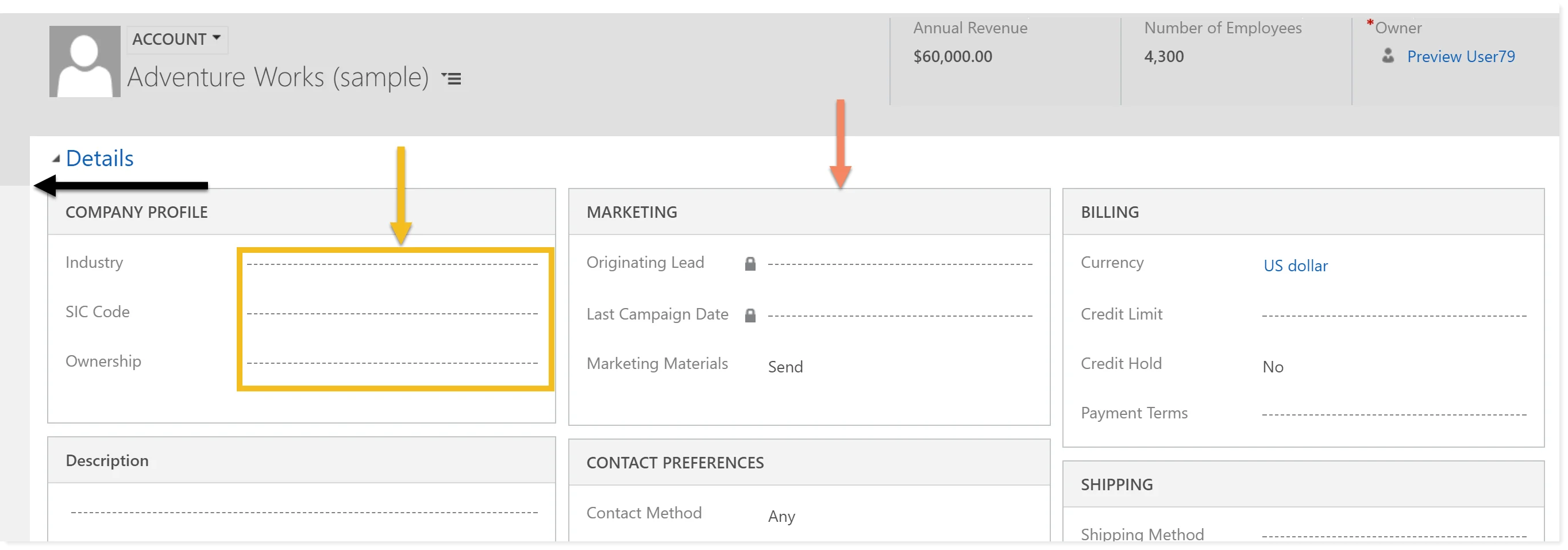
- Orange arrow – shows the border and section heads
- Yellow arrow – shows how the dashed lines are placed for input fields
- Black arrow – how neatly the header and details sections are being merged.
- Overall you don’t see any white spaces right?
Section colors on form


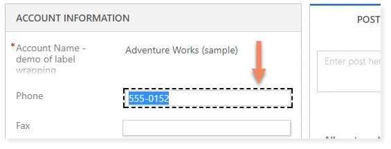
Highlighting focus field when using Keyboard for form navigation
See the screenshot below and you’d notice the black dashed border around the current input field. That is because I used Tab to reach this field and now it gives me a visual indication of the focussed field
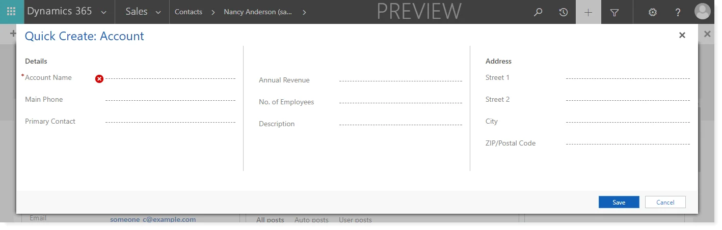
Quick Create UI tweaks
Quick create hasn't been spared either, it now opens in a very neat fashion blurring out the background to get user's attention.

New themes available
As I stated earlier, new color themes have been introduced. You can go ahead and change them from Settings > Customizations > Themes
Blue Theme

Orange Theme
Default Theme
Other notable UI stuff
- The whole UI is now responsive
- Grids now look very polished
- Fonts are uniform across the system
- Overall the entire system looks premium
So this is it for now. I'll keep on digging deep into the preview organizations and will update this post as and when somethings is available.
In the meantime if you find out something that is not covered here. Feel free to post it down in the comments below.